Overview
Disclaimer
The project is real, but I've removed identifying information such as brand colors and logos.
Challenge
At a startup with a rotating team of UX designers, the existing style guide overlooked accessibility, leading to inconsistent and inaccessible designs across projects. The task was to create a new design system that ensured accessibility and consistency, making it easy for everyone to use and maintain.
Approach
As a team: Complete a heuristic analysis to determine usability and accessibility issues
Personally: Rebuild the design system while re-designing the product in order to ensure feasibility and usefulness
Outcome
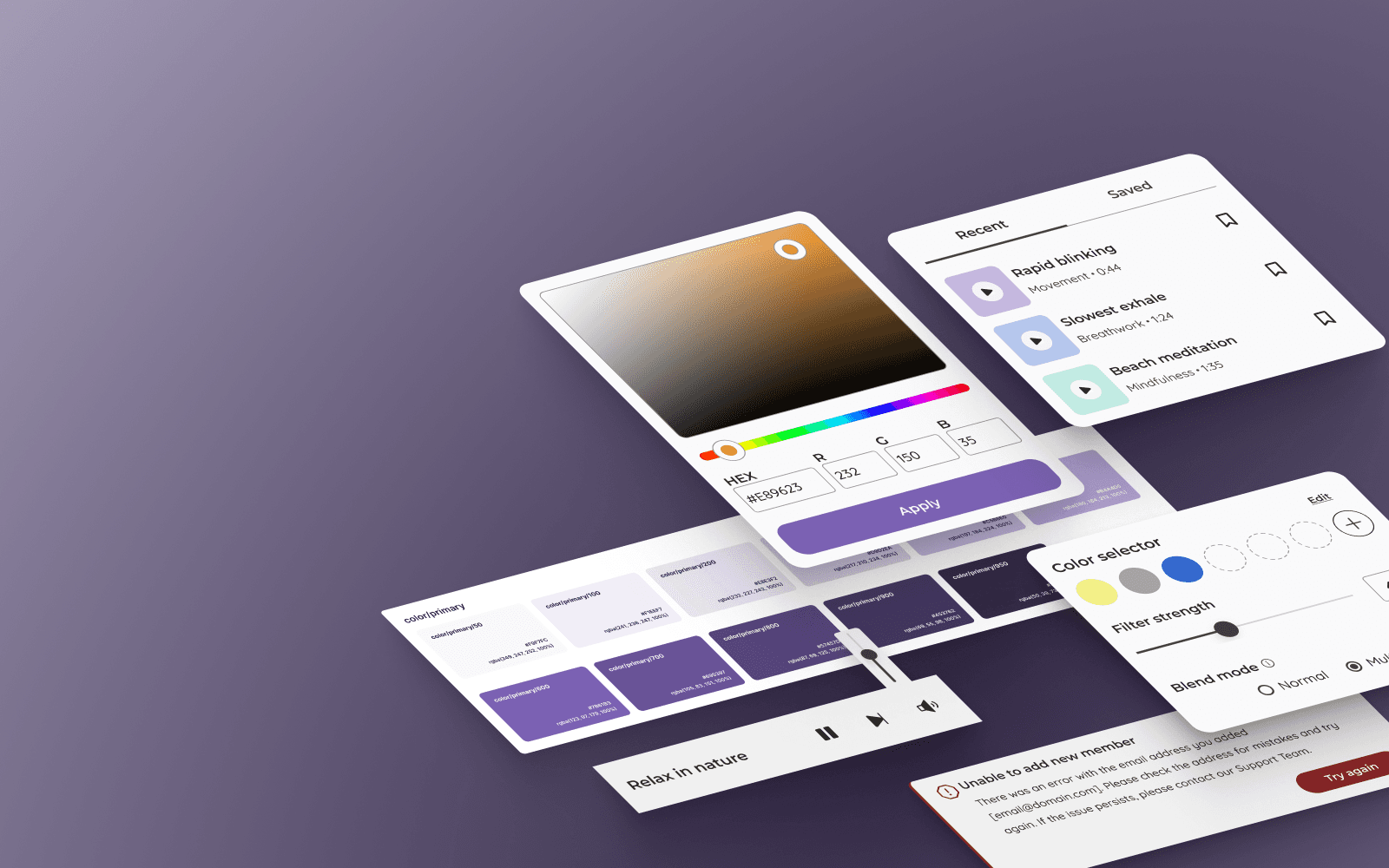
A cohesive design system that worked across all products, including marketing materials. It featured an improved color palette and a cleaner, more accessible aesthetic.
The full case study is password protected
Enter password to continue
See the design system at work
Take a look at my case study on the Chrome extension re-design
