Overview
Challenge
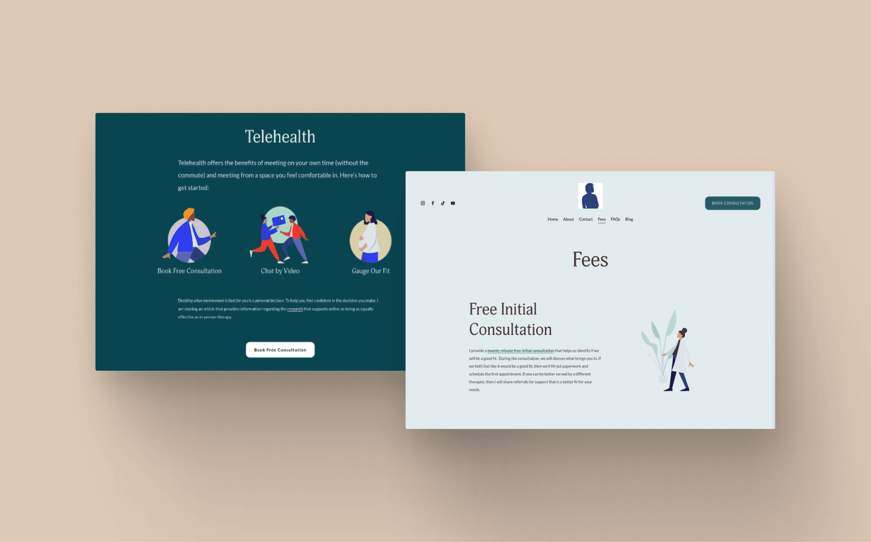
The client, a therapist with a private practice, had an existing website that came across as word heavy and didn’t give the welcoming and peaceful vibes she was aiming for. While the goal was to gain new clients through the website, there was a deeper goal of meeting folks wherever they are in their therapy journey.
Approach
Infuse personality throughout the website through illustrations and color palette. Organize and build out content while maintaining voice.
Outcome
A warm and inviting website for learning, returning, and eventually committing to therapy.
The story
Setting the tone
"It needs to be less of a Mildred and more of a Millie," my client playfully remarked about her existing website, setting the perfect tone for our collaboration.
We started by discussing her goal(s) for the website: create a warm and safe space for everyone to learn about therapy. My client wanted individuals to feel welcome even if they didn't convert initially. The keywords that continually popped up in conversations were inclusive and welcoming. These words framed all of my design decisions.
Understanding the users
With an understanding of the goals, we identified three main types of users who use the website:
Individuals actively searching for a therapist
Those referred to therapy
Folks who are on the fence
To gain deeper insights, I dove into secondary research by exploring a variety of therapy websites. I wanted to get a feel for how users typically navigate these sites and how information is structured. I took plenty of screenshots, capturing everything from homepage layouts to detailed content sections and overall information architecture (IA). This research was invaluable, as it provided a solid foundation for our redesign. It showed us what works well and what could be improved, ensuring that our new design would meet user expectations and needs effectively.
Content organization
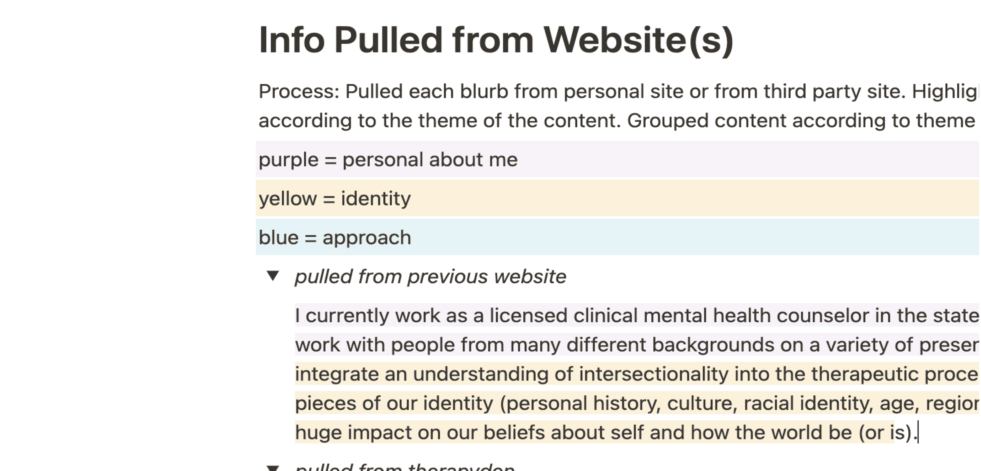
I took comprehensive screenshots of the existing website and pulled all the content into Notion for thorough organization. The client had such lovely and warm bits of writing scattered throughout the site, and I wanted to maintain her unique voice while bringing more clarity and structure to the content.
As someone who thrives on visual organization, I turned to color coding content within Notion. Each piece of content was tagged and color-coded by topic, making it incredibly easy to see how everything fit together. This method not only streamlined the process but also set the stage for a more cohesive rewrite later on. The color coding allowed me to quickly identify which areas needed attention and ensured that nothing was overlooked. This led to a more seamless transition in the new design, where each piece of content found its rightful place.
Design and organization
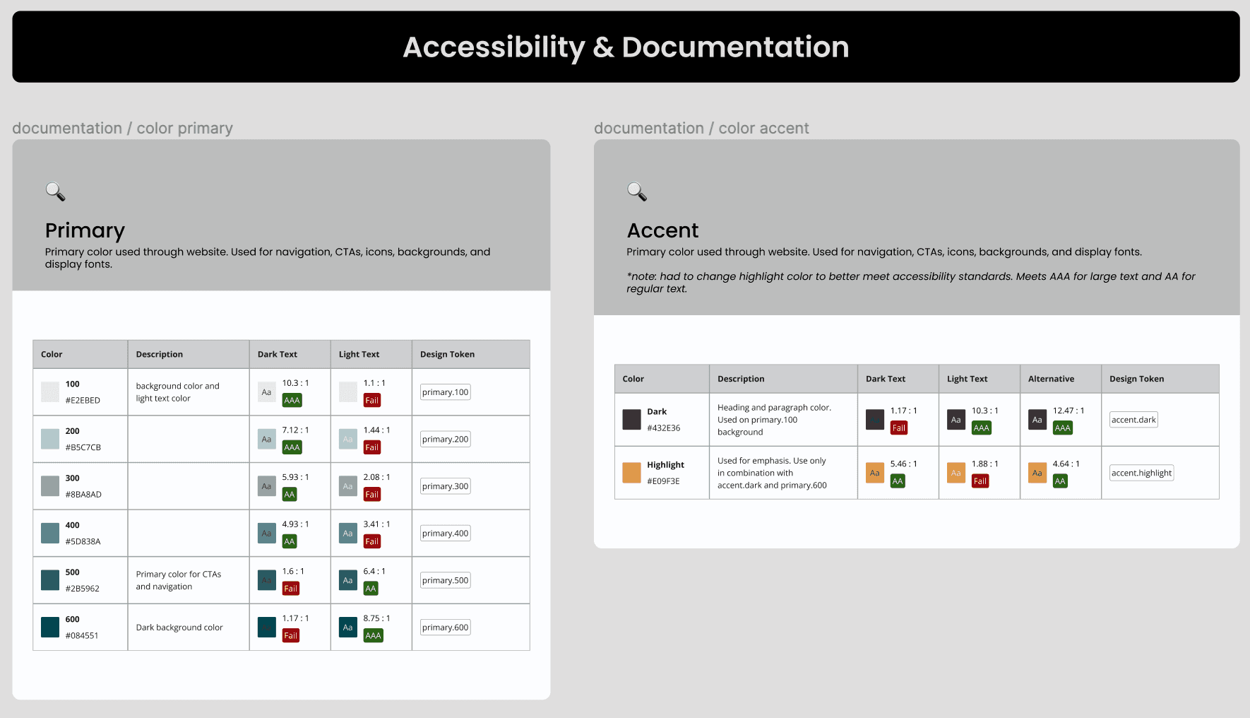
The principles of inclusivity and warmth propelled the creation of a style guide. Existing beach pictures inspired a teal color palette that met accessibility standards, ensuring the design was both aesthetically pleasing and accessible to everyone.
Documentation and accessibility examples
I chose the Humaaans illustration pack for its ease of use and diversity, which the client preferred over generic stock photos.
I brushed up on my SquareSpace skills (thanks to blog articles and YouTube) and began the redesign. While keeping the existing IA, I leveraged the color-coded content for improved organization and introduced consistent design styles.
Handoff and future-proofing
To ensure buy-in throughout the process, I stayed in touch with the client and shared work as I continued to iterate and refine choices. This helped me ensure the final design fit her goals.
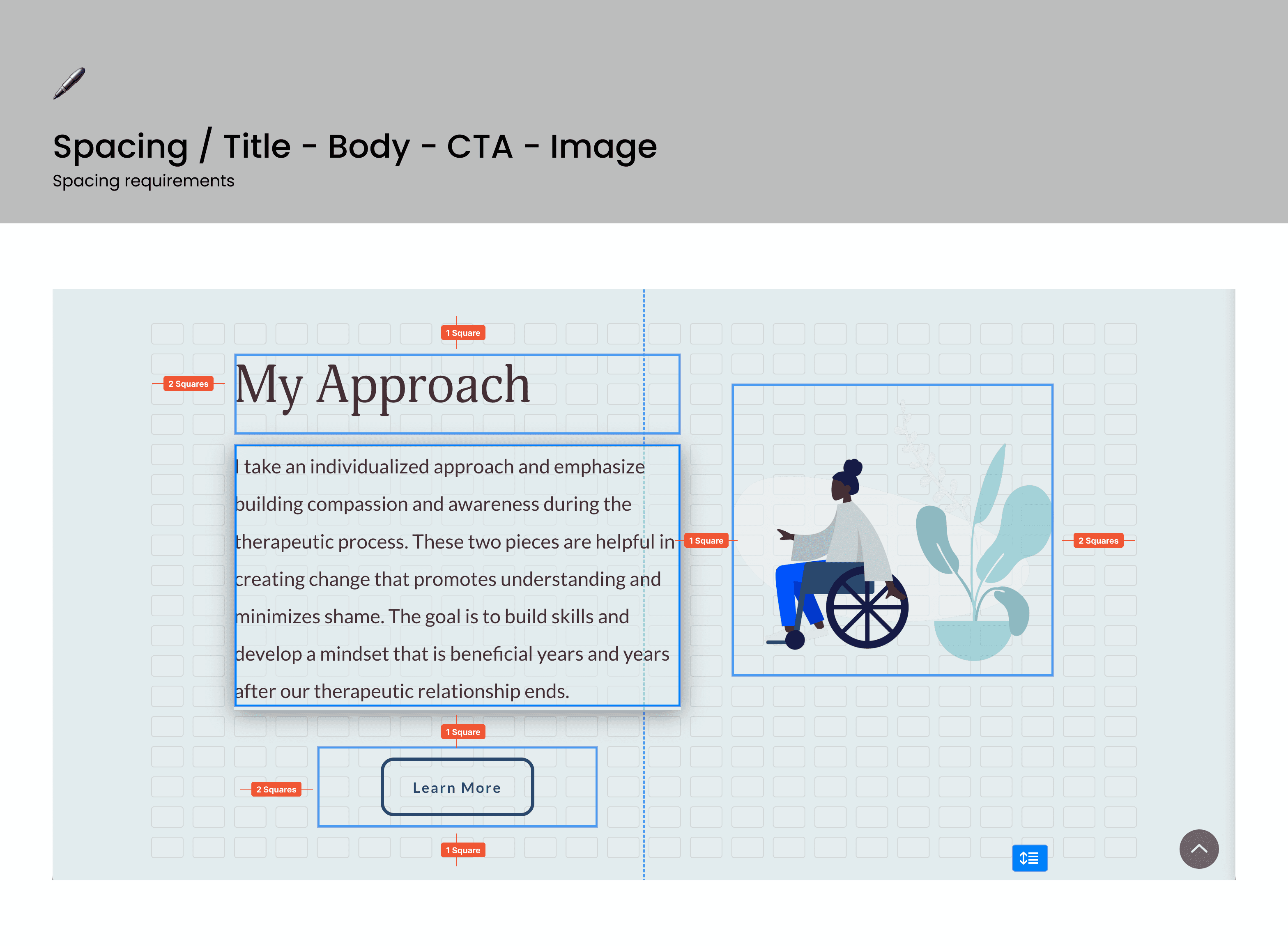
Once the redesign was complete, I created a comprehensive handoff package inspired by design system documentation. This package included all the essential design elements such as color palettes, fonts, and specific SquareSpace settings. It also featured future-proof tips to help the client make adjustments confidently.
My goal was to empower her to maintain and update the website independently, without feeling overwhelmed. This included guidance on making minor tweaks, adding new content, and keeping the design consistent with the established style guide.
The reflection
In the end, I was incredibly proud of what we accomplished. I helped create a website that's all about creating space for folx to learn more about therapy, have a space to return to, and reach out when they are ready to commit.
And I learned some SquareSpace skills along the way.
Cheers!


